Donation Page TL;DR:
- Choose the right page type (evergreen, campaign, or embedded) with a simple URL Match your branding and keep the design clean
- Use specific ask amounts tied to impact, personalized with ask arrays
- Default to recurring giving and reduce checkout friction
- Add trust signals like social proof and impact statements
- Place giving opportunities across your site, not just one page
- Track and test performance to keep improving over time
Let’s talk about your donation page.
If a donor makes it all the way to your website giving page, so much of the legwork has already been done, that actually giving in that moment should be easy.
Notice the “should.”
Because the reality is: Many nonprofits face friction from clunky, antiquated donation pages…with slow load times, weak copy, and branding that only half-matches the rest of the website.
Too often, one (or many) of these missing pieces adds up during a donor’s chosen moment to give. Causing confusion and frustration.
So…the donor leaves. Before giving.
If this feels like your donation page, you’re not in it alone.
At Virtuous, we believe the donation page is a pivotal part of every donor’s generosity journey. And not one that should be skipped or taken lightly.
That’s why we built Virtuous Raise, our online giving platform. In this post, we’ll cover the top 10 key elements of a donation page…with actual donation page examples along the way to get you feeling creative, inspired, and ready to optimize your nonprofit’s donation page.
10 Key Elements for a Stunning Donation Page That Converts
We hear the same frustrations from our customers over and over. Their old donation pages seemed to get in the way of the giving experience they wished they could create for their donors.
Any of this sound familiar?
- Donors keep getting pushed off-site. Standalone pages mean an extra click and a detour that doesn’t quite feel like home.
- The pages are clunky. Slow to load, painful to use, right when a donor decides to be generous.
- Mobile and speed are a gamble. Pages that drag, break after edits, and quietly drop conversions.
- No clean way to organize gifts. No dropdowns, no gift catalog, just a giant list for donors to scroll through.
- The branding feels off. A giving page that doesn’t match your site feels less polished, and a little less trustworthy.
- A headache to manage. One missed toggle, and donations vanish from reporting. One org thinks they’ve raised $0.
Every tip below is built to fix exactly these problems.
1. Start with the Right Page Set-Up
Most people want to know what the best donation page designs look like, but a good donation page always starts with strategy first.
So first, think about what type of donation page you need:
Evergreen Donation Page
Your always-on giving page. This is the year-round destination supporters can visit anytime to make a general donation.
Campaign Landing Page
A donation page built for a specific appeal, campaign, or moment. It should match the message, urgency, and audience of that effort.
Embedded Donation Experience
A donation form or giving prompt built directly into another page on your website, like a homepage, blog post, or campaign page, so donors can give without navigating to a separate destination.
Keep Your Donation Page URL Simple & Clear
Once you’re clear on the donation page type, your next element to consider is the URL. Keep the URL simple, clear, and easy to share.
Donate Button Placement
Another important strategic move is considering where to place your donate buttons on the donation page…a step that’s easy to skip, especially if you’re building your donation page in a hurry.
Think about where donor intent is high, like your main navigation, campaign pages, blog posts, and event pages.
These spots are prime real estate for “donate now” buttons. In most cases, those buttons should link to the most relevant donation experience…your evergreen donation page for general giving, or a campaign-specific page when the ask is tied to a specific appeal.
2. Pay Attention to Branding
No one knows your nonprofit like you.
The colors, the fonts, the logos.
But even a first-time donor who stumbles on an off-brand donation page will feel confused.
One of the biggest questions for a new donor is…Can I trust this website? And if the donation page changes appearance drastically from those colors, fonts, and logos you (and your donors) know and love, this is a friction point.
Help Donors Feel Like They’re in the Right Place
A donor should feel like they landed in the right place right away.
Your donation page should look and sound like the rest of your organization, using the same logo, color palette, imagery, and tone your supporters already recognize. When someone clicks from an email, social post, or campaign page, the experience should feel consistent all the way through.
Match the Page to the Campaign
If you’re running a year-end appeal, an emergency campaign, or a specific fundraising push, the donation page should reflect that message. A generic all-purpose form can work for evergreen giving, but campaign traffic usually converts better when the page feels specific to the moment.
Keep the Design Simple
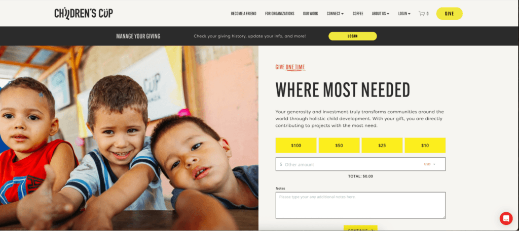
Use one strong image or visual anchor, keep the layout clean, and keep the focus on the gift. The goal is to build confidence, not create extra noise. Some of the best donation page designs do exactly this, leading with one clear focal point instead of crowding the page.
In this donation page example from our customer, Children’s Cup, you can see how one hero image draws you into the giving experience.
Virtuous Raise is built for branded donor experiences, with real creative control over the page, form, and flow. Plus, the new Raise Builder UI also makes that work easier, with tools like the hierarchical Site Tree, searchable component panel, rebuilt drag-and-drop experience, and stronger accessibility support for the people building the page.
3. Get Specific With Ask Amounts & Impact
A generic donation page leads to generic gifts. The more specific you get with your “ask,” the better.
Tie Each Ask to Impact
Notice how Compass to Care’s donation page example (below) ties specific gift amounts to extremely clear impacts.
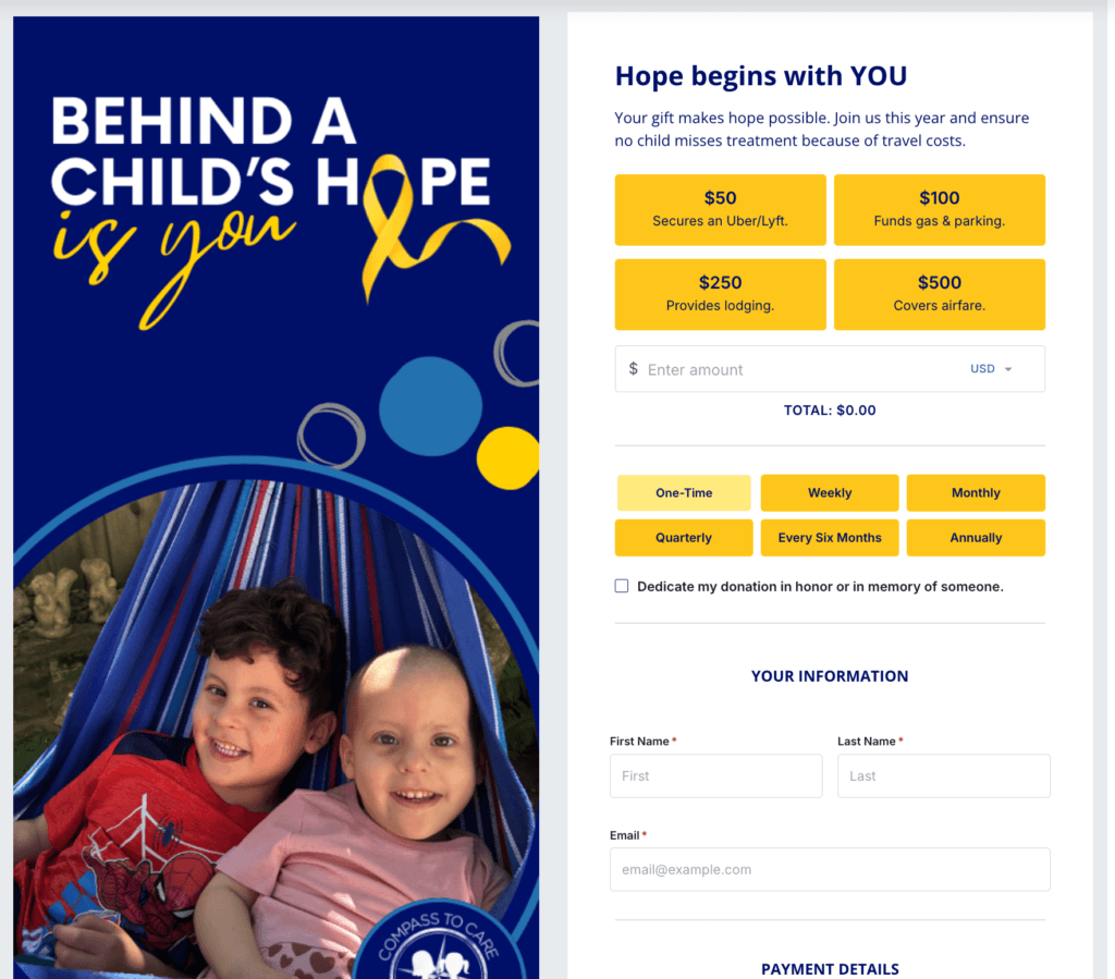
This helps the donor connect with their why as they give. In this case, think of how different it is for a donor to know that their gift of $100 “funds gas and parking” as opposed to just donating to the general fund.
At our core, we’re emotional beings. And giving is an emotional act. Meeting donors in that emotion for the mission creates a donation page that won’t just convert but will resonate more deeply with your donors.
Tap Into the Power of Ask Arrays
One simple way to strengthen your ask is to move beyond the exact same gift ladder for every donor.
Not every supporter should see the same suggested amounts, especially if one donor is brand new and another has a long giving history with your organization.
That’s part of what makes Responsive Ask Arrays so powerful in Virtuous Raise. For known donors, Raise personalizes suggested gift amounts based on their CRM history. For everyone else, it uses AI-driven signals (local income data, device type, and timing context) to generate amounts that feel right for that donor, in that moment.
Either way, a custom amount field is always there, and a static fallback ensures no donor ever sees a broken experience.
4. Make Recurring Giving a No-Brainer
In our Nonprofit Benchmark Report from 2026, the nonprofits in our study generated an average of nearly 21% of their revenue from recurring giving. The top quartile? 44%.
So for all of us planners in the room, we know how the ups and downs of fundraising can really take a toll.
But top nonprofits are generating nearly half of their revenue from planned, structured, monthly giving. That’s a huge win.
And the donation page is where this starts.
In this example from our customer, Twelve21 Global, you can see how their donation page defaults to the recurring option.
So, when a donor lands on their page, they immediately consider whether or not a monthly gift feels right for them…before simply considering a one-time gift.
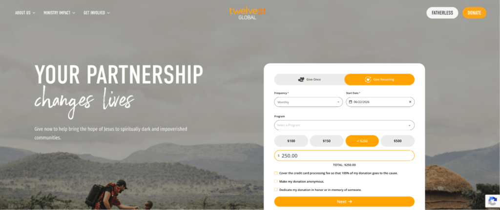
Virtuous Raise can help here, too. With features like recurring nudges and flexible form experiences, Raise makes it easier to put the monthly option in front of donors earlier and more intentionally, so recurring giving feels like a natural next step instead of an afterthought.
5. Reduce Friction at Checkout
You can have the right branding, a strong ask, and a smart monthly giving strategy, but if the checkout experience feels clunky, donors can still drop off right at the finish line.
Address Last-Minute Objections
At this point, your donor is ready to give. Your job is to make that feel as easy as possible.
Ask only for the information you actually need. Keep the page clean and focused. Make the main donate button easy to spot, and make sure the experience works just as well on mobile as it does on desktop. A slow page or a cluttered form can create just enough hesitation to lose the gift.
Consider any potential barriers to your donors taking the leap and giving. For example, some questions that might come up at the last minute:
- Is this donation page secure?
- Are there other ways to give online?
- Is my gift tax-deductible?
In this donation page example from Seattle’s Union Gospel Mission, they address all of those potential objections right next to their “Next/Donate” button, so donors have an easy place to get answers.
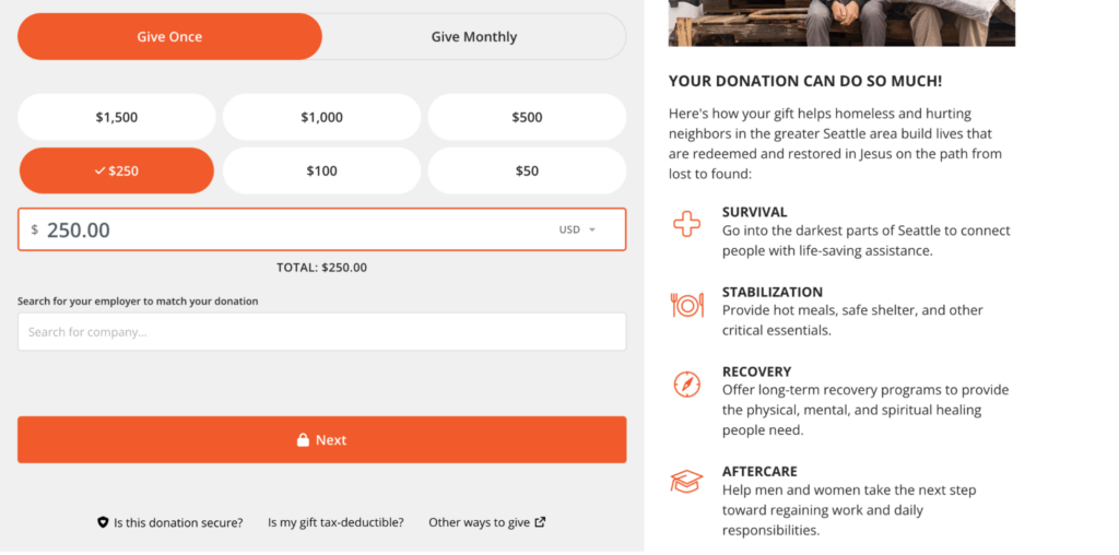
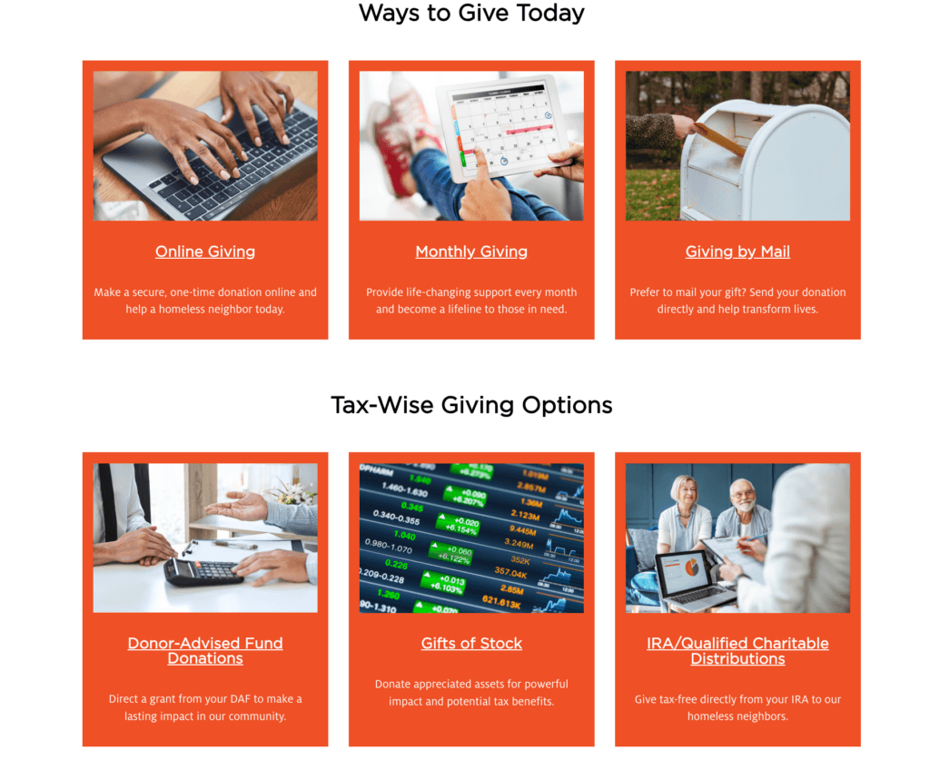
Offer Various Ways to Give
It also helps to offer multiple giving options. Credit and debit cards are the baseline, but depending on your audience, options like ACH, PayPal, or digital wallets can make it easier for someone to complete their gift without a second thought.
Building off of the donation page example above, when you click “Other ways to give,” on Seattle’s Union Gospel Mission’s form, donors move to a page that clearly explains all giving options, including if a donor prefers mailing in a donation.
Virtuous Raise makes the giving experience easier for donors by supporting digital wallets for faster checkout. That flexibility can remove friction at the final step and help more donors complete their gift.
6. Add Trust, Proof, & Motivation
Donors want to feel inspired when they give.
But they also want to feel confident they’re in the right place.
Keep the Page Reassuring
Your donation page should feel clear, legitimate, and easy to understand. If anything feels off, cluttered, or confusing, hesitation can creep in fast.
This is also where a simple campaign cue can help. A small website banner or countdown timer can reinforce that the appeal is active and real, especially during a match or deadline-driven campaign.
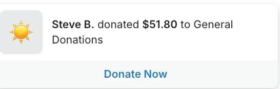
Show That Other People Are Giving
Social proof works because it reminds donors they’re not the only ones showing up.
You don’t need to overdo it. Sometimes, a donor wall, donor leaderboard, progress bar, or fundraising thermometer is enough to show momentum and help the page feel alive.
The key is to use just enough proof to build confidence, not so much that the page starts to feel busy.
Help Donors See What Their Gift Does
Trust matters. But motivation matters, too.
When a donor can clearly see what their gift will do, the page becomes more compelling. That’s why impact statements work so well, especially when they connect a gift amount to a specific outcome.
With widgets in Virtuous Raise, you can add social proof, urgency, campaign progress, and impact cues around the donation experience, so the form itself doesn’t have to do all the work.
7. Put Donation Opportunities in More Places
Your donation page matters.
But it shouldn’t be the only place someone can give.
A lot of donors are ready to act before they ever make it to your main giving page. They might be reading a campaign update, skimming a blog post, landing on an event page, or scanning a QR code from an in-person appeal. Those moments matter.
Meet Donors Where They Already Are
Instead of sending every supporter to the same place, think about where giving intent is already high across your website and campaigns.
Your homepage, campaign pages, blog content, event pages, and seasonal appeals can all become natural pathways to give. The easier it is for someone to respond in the moment, the better.
8. Track What Actually Drove the Gift
A good donation page should help you raise more today and learn more for next time.
If you have no idea what brought a donor there, it’s hard to know what to repeat. Was it the email? The campaign page? The QR code at your event? The social post that finally clicked?
Connect Gifts Back to the Right Efforts
The more clearly you can connect gifts back to the campaign, channel, or message that drove them, the easier it is to make smarter decisions the next time you build a page, launch an appeal, or test a new strategy.
Only Ask What You’ll Actually Use
Of course, this takes some balance.
You don’t want to turn your donation page into a survey. But when a question helps you understand donor behavior or improve future campaigns, it can be worth including.
A simple “How did you hear about us?” field can go a long way when you actually use the answer.
With motivation codes in Virtuous Raise, donors can identify how they found your organization right on the giving page, giving your team cleaner insight into what’s actually driving gifts.
9. Measure What’s Working
A donation page is not done just because it looks good.
Once it’s live, the real question is whether it’s actually helping more donors complete their gifts.
Pay Attention to the Right Metrics
You don’t need a massive analytics deep dive here. But you do want to keep an eye on the numbers that tell you whether the page is working.
That can include conversion rate, average gift, recurring-giving conversion, abandonment signals, donation source performance, and even how the page performs on mobile versus desktop.
The goal is simple. Figure out what’s helping donors follow through, and what might still be getting in the way.
Then Use What You Learn
This is where testing matters.
Sometimes a stronger headline helps. Sometimes it’s a better image, a clearer recurring-giving prompt, or a different set of ask amounts. The point is, you won’t always know what works best until you test it.
With A/B Testing built directly into Raise, teams can compare two full page versions and measure results based on fundraising metrics like revenue, conversion, average gift, and recurring growth.
10. Keep Improving Over Time
The best donation pages aren’t built once and left alone.
They’re tested, refined, and updated over time as your team learns what actually helps donors follow through.
That might mean testing a new headline, swapping out the hero image, adjusting your gift ladder, changing the monthly default, shortening the page, simplifying the form layout, or reworking how you show urgency or social proof.
The point is, best practices are a starting point. Not a final answer.
What works for one nonprofit, one campaign, or one audience may not work the same way for another. That’s why optimization matters.
A/B Testing makes it easier to compare page versions and keep improving based on real donor behavior, while tools like ask arrays make the ask itself more adaptive over time.
And as donation experiences keep evolving, that kind of flexibility matters. The goal isn’t just to drive more traffic to the page. It’s to build a page that works better for more donors.
Your Donation Page Is a Living Thing
Every single donation page example in this post was created by our customers using Virtuous Raise.
If you feel inspired by these donation page examples, but you’re still stuck fighting a clunky builder, off-brand forms, and a checkout that leaks gifts at the finish line.
That’s the gap we built Virtuous Raise to close.
Branded pages you control, ask arrays that adapt to each donor, recurring nudges that lift monthly giving, and A/B testing so you stop guessing what works.
You don’t have to rebuild your page alone, and you don’t have to wonder what it could do.
In a quick demo, we’ll walk through how Raise would handle your toughest pages and where you’re likely leaving gifts on the table right now.
Stop losing donors at the moment they’re ready to give.
Book your Virtuous Raise demo today.
Donation Page FAQs
How do I create a donation page?
Choose a platform, pick your page type (evergreen, campaign, or embedded), then add your branding, ask amounts, and a simple checkout. Tools like Virtuous Raise let you build one in minutes.
What are the different types of donation pages?
The three main types are evergreen pages for year-round giving, campaign pages built for a specific appeal, and embedded forms that live right on other pages of your site.
What are the key elements of every effective donation page?
Clear branding, specific ask amounts tied to impact, a recurring option, an easy checkout, and trust signals like social proof. Every element should move the donor closer to completing their gift.
How do I measure whether my donation page is working?
Watch your conversion rate, average gift, recurring-giving conversion, and abandonment signals. Check mobile against desktop too, since that’s where a lot of gifts quietly drop off.
What should the URL for my donation page be?
Keep it short and easy to say out loud, like yoursite.org/donate. A clean URL is simpler to share on social, in print, and over the phone.
How do I promote my donation page on social media?
Link straight to the page in your bio, posts, and stories, and use a QR code for in-person or printed appeals. Match each post’s message to the page so the experience feels consistent.
How do I add a cover image or QR code to my donation page?
Most giving platforms let you upload a hero image in the builder and generate a QR code that links to your form. Virtuous Raise handles both right inside the builder.
How do I write an inspiring message for my donation page?
Speak to one person, name the problem clearly, and show exactly what their gift makes possible. Specific always beats general.
What makes a strong donation page headline?
A strong headline names the stakes and the donor’s role in the outcome. For emergency appeals, lead with urgency and the immediate need.
How do I encourage donors to give any amount, not just preset gifts?
Always include a custom amount field next to your suggested gifts. The suggestions guide the decision while the open field welcomes every donor.
What’s the best platform for suggested gift amounts?
Look for one that supports tailored ask arrays, not just static amounts. Virtuous Raise can adjust suggested gifts based on donor history while keeping a custom field available.
What are the best online donation platforms for nonprofits?
The right platform gives you creative control, recurring tools, and real analytics. Virtuous Raise is built for nonprofits that want branded, high-converting giving experiences.
Are there free donation tools or apps for nonprofits?
Some platforms offer free tiers, though they often add per-transaction fees or limit customization. Weigh the “free” cost against the gifts a generic experience can lose you.
Should I ask donors for their employer or occupation on the donation form?
Only if you’ll use it, for matching gifts or wealth screening. Otherwise it’s one more field that can cost you the gift.
Where should my donate buttons link, and how many places should they live?
Put them anywhere donor intent is high: your main nav, campaign pages, blog posts, and event pages. Each should link to the most relevant page, your evergreen page for general gifts or a campaign page for a specific appeal.